2016年9月27日 星期二

update activity data from gragment


直接看code吧....

當點選   原本的   textview   ..就會觸發 onclickListener...

然後呼叫  List<Fragment> allFragments = getActivity().getSupportFragmentManager().getFragments();

得到bindof 的activity 的 all fragment...存放在allFragments

然後利用   for loop 和  instanceof 來判斷...

是屬於  PersionalFragment..  就呼叫  updateData()..來更新textview的文字....

有了這個solution... 就可以做到改變fragment 的資料

 for (Fragment fragment : allFragments) {
                        if(fragment instanceof  PersionalFragment) {
                            PersionalFragment f = (PersionalFragment) fragment;
                            f.updateData();
                            Toast.makeText(thiscontext, "PersionalFragment  exist", Toast.LENGTH_SHORT).show();
                        }
                    }


================================================
public class PersionalFragment extends Fragment {

    TextView textView;
    Context thiscontext;
    View v2;

    @Override    public void onCreate(Bundle savedInstanceState) {
        super.onCreate(savedInstanceState);
    }

    @Override    public View onCreateView(LayoutInflater inflater, ViewGroup container,
                             Bundle savedInstanceState) {

        View v = inflater.inflate(R.layout.fragment_persional, container, false);
      //       v2 =  inflater.inflate(R.layout.activity_main, container, false);        thiscontext = container.getContext();

        textView = (TextView)v.findViewById(R.id.textView);

        textView.setOnClickListener(new View.OnClickListener() {

            @Override            public void onClick(View v) {
                /*               
                */
                List<Fragment> allFragments = getActivity().getSupportFragmentManager().getFragments();
                if (allFragments != null) {
                    for (Fragment fragment : allFragments) {
                        if(fragment instanceof  PersionalFragment) {
                            PersionalFragment f = (PersionalFragment) fragment;
                            f.updateData();
                            Toast.makeText(thiscontext, "PersionalFragment  exist", Toast.LENGTH_SHORT).show();
                        }
                    }
                }

                /*                MainActivity activity = (MainActivity)getActivity();
                ViewPagerAdapter adapter = new ViewPagerAdapter(activity.getSupportFragmentManager());                PersionalFragment a = (PersionalFragment)adapter.getItem(0);                a.updateData();                */                //getActivity().getSupportFragmentManager().beginTransaction().replace(R.id.persional,new PersionalDetailFragment()).commit();
                Toast.makeText(thiscontext, "text onclick", Toast.LENGTH_SHORT).show();

            }
        });

        return v;
    }

    public void updateData(){
        textView.setText("Changed");
    }

}

2016年9月25日 星期日

新成員ConstraintLayout

Ref :  http://litotom.com/2016/09/21/android-studio-2-2-constraintlayout/

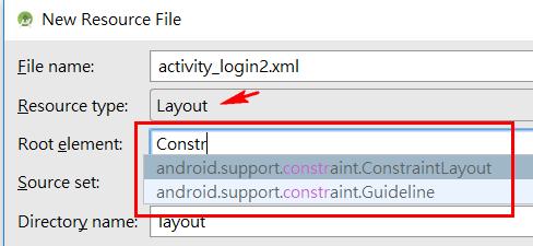
此次Android Studio 2.2推出新的版面編輯器(layout editor)可以說是為了配合Layout的新成員ConstraintLayout所設計的,原本在iOS中功能非常強大的AutoLayout的設計理念是讓畫面元件的規劃能夠盡量扁平化,Android也看到了,終於推出類似原RelativeLayout功能的ConstraintLayout元件,首次登場的ConstraintLayout元件將帶來更豐富的畫面設計體驗。

新成員ConstraintLayout

在之前的版面設計,大都使用LinearLayout與RelativeLayout能夠實作出大部份的版面,但Layout層級太多會造成設計更動上的困擾,取用元件時也較耗費資源。因此,如何能將複雜的版面設計的層級較為扁平化呢? 組織要扁平化,Layout也要扁平化才有效率。Android正式推出ConstraintLayout元件,它就是為了這個目的而誕生的。

加入support-constraint類別庫

ConstraintLayout元件是外加的,它可支援到Android 2.3的手機,使用前必須先導入support.constraint類別庫,請開啟Gradle Scripts中的app模組層級的build.gradle,在dependencies區塊中加入:
上述使用的是1.0.0-alpha8的版本,未來新版或正式版推出時可再依其版號更換。完成後記得要Sync project with gradle files。

新增一個layout檔

加入類別庫後,先建立一個以ConstraintLayout為根元素的layout檔,點擊專案中的app模組後,功能表File/New/Android resource file,為這個layout訂定名稱為activity_login2.xml,目的是設計一個登入畫面,再將Resource type下拉更換為Layout,如下:


在上圖的Root element中鍵入ConstraintLayout的部份名稱,立即會自動出現下拉選單,讓我們選擇android.support.constraint.ConstraintLayout類別,完成後如下:


產生layout檔後的畫面如下,左方是元件選擇區,新版在點擊元件時與舊版點一下後再到畫面中點一下不同,要以按住元件後拖拉的方式,如下圖:


什麼是Constraint?

Constraint的中文翻譯是限制、條件、約束,由劍橋英語字典對它的解釋為「something that controls what you do by keeping you within particular limits」,意思是一些讓你能夠控制的東西。假如我們想要一個元件依照我們的意思配置在版面中的特定位置,就應該為它加上一些控制條件,而這些限制條件就稱為Constraints。
一個無任何Constraint的元件,它預設會配置在layout的最左上角(0,0)處,如果一個畫面中有多個元件都未設定任何Constraint時,它們全都會擠在畫面的左上角。
請在左方元件區點擊TextView元件並拖拉到畫面中,任何一個位置,結果如下圖:

當一個元件被放到ConstraintLayout時,預設會先放置在滑鼠放開的位置,那沒任何Constraint的元件不是應該在畫面的左上方嗎? 這是為了方便設計者,讓設計者能再為它設定Constraints,但如果在設計時都未為元件設定Constraint,執行時元件還是會擠到畫面左上方的。
提示
如果將元件放進去後,元件會自動跑到左上角,造成難以設定Constraint時,這是因為導入新的類別庫而無法處理,可重啟Android Studio或在功能表File中選擇Invalidate Caches / Restart後,即可正常顯示。

為元件設定Constraints

ConstraintLayout和RelativeLayout相似,元件應找一個對象對齊,對象可以是parent容器,但功能更有彈性。當點擊選取一個元件時,元件的四週會出現可調的圓點,可用來對齊元件的四個邊界,如下圖:
上圖中TextView的文字下緣有一個橢圓水平的長條,也是用來對齊內容物下緣(Baseline Constraint)。而四個角落的四方型則可改變元件的大小。同樣的,元件的Constraints設定的對象可以是另一個元件,或是容器本身,也就是ConstraintLayout。請按住左邊圓點後拉動設定第一個Constraint到容器的左邊,如下圖:

此時已為TextView元件設定一個向左邊的Constraint,向parent左邊對齊並距離16dp,原始碼如下:

ConstraintLayout中的元件規定一個元件至少要有兩個Constraints,分別是水平與垂直方向的Constraints,因此如上圖箭頭指處,這個TextView並未符合規定,所以出現錯誤提示訊息。請再拉動TextView上方的圓點,向容器的上緣靠近,再設定一個垂直方向的Constraint,如下圖:


由於元件現在擁有一個水平與一個垂直的Constraints,已符合最低限度,原始碼也不再有錯誤訊息,如下:


popup windows on android

Ref : http://www.jianshu.com/p/d9407f799d2d

效果还是很赞的,看下动态图

simple.gif

这个项目是我在2015年7月份左右写的,时隔半年,终于有人问津,但时隔半年,也感到这个项目有许多的不足之处,怀着激动的心情今天来讲解并完善这个项目。

选择实现方式

若是看到第一眼让我做这个效果,我肯定会选择PopuWindow去做,PopuWindow可以实现显示隐藏效果也自带阴影效果,看上去是不错的选择,网上也有类似库DropDownMenu就是利用PopuWindow实现,但事实上在菜单切换的时候会很不流畅(用的不爽),思维局限的时候容易钻死角,尝试过甚至自定义PopuWindow,最后都毫无办法改善那点问题,最后在网上偶遇一个demo使用View的显示隐藏加些动画效果就解决了我的难题,最终我放弃使用PopuWindow,利用最基本的布局实现了这个项目。
当遇到难题束手无策时,不妨暂且放下,待思路清晰时,或许它根本就不是个问题


文/dongjunkun(簡書作者)
原文鏈接:http://www.jianshu.com/p/d9407f799d2d
著作權歸作者所有,轉載請聯繫作者獲得授權,並標註“簡書作者”。


这个项目做了哪些,没做哪些?

这个项目并没有实现菜单及里面的逻辑,仅仅提供了一套实现菜单的框架,菜单的样式可完全自定义,目的是为了快速集成,又可扩展(实用),在很多时候,选择开源框架我会将扩展性放在首位,不然再好看再炫我都不会轻易使用,当然,既炫又实用的东西我是不会嫌弃的。

实现思路

其实这个项目可以直接使用Xml布局实现,结构是这样的


嗯,大概的结构就是这个样子,但使用xml文件有个弊端,tab的个数不可以动态控制,menu也是一样,tab包括menu和之间的切换和动画处理起来都比较麻烦,我才有意将其封装为独立控件,只需在一处集中处理这些麻烦,提供简单易用的api。

一些改进想法

  • menu之间的切换支持手势
  • menu底部留白
  • tab可滑动
  • 可使用xml文件布局,却不需要处理其他问题
  • 更灵活的api
    新版的DropDownMenu,敬请期待,预览图:


StateProgressBar Library.

Ref :  https://github.com/kofigyan/StateProgressBar


StateProgressBar

StateProgressBar is an Android library to realize the various states and transitions in a ProgressBar.
alt tag

Quick Start

Get a feel of how it works:
Get it on Google Play
Check the wiki for detail documentation.

Gradle

Add the following dependency to your build.gradle :
dependencies {
     compile 'com.kofigyan.stateprogressbar:stateprogressbar:0.0.1'
}

XML

<com.kofigyan.stateprogressbar.StateProgressBar
    android:id="@+id/your_state_progress_bar_id"
    android:layout_width="wrap_content"
    android:layout_height="wrap_content"
    app:spb_currentStateNumber="three"
    app:spb_maxStateNumber="four"
    app:spb_stateBackgroundColor="#BDBDBD"
    app:spb_stateForegroundColor="#009688"
    app:spb_stateNumberBackgroundColor="#808080"
    app:spb_stateNumberForegroundColor="#eeeeee"
    app:spb_currentStateDescriptionColor="#009688"
    app:spb_stateDescriptionColor="#808080"
    app:spb_animateToCurrentProgressState="true"
    app:spb_checkStateCompleted="true"/>

To add description data to StateProgressBar :
String[] descriptionData = {"Details", "Status", "Photo", "Confirm"};

@Override
protected void onCreate(Bundle savedInstanceState) {
    super.onCreate(savedInstanceState);
    setContentView(R.layout.your_layout);

    StateProgressBar stateProgressBar = (StateProgressBar) findViewById(R.id.your_state_progress_bar_id);
    stateProgressBar.setStateDescriptionData(descriptionData);

}

XML Attributes

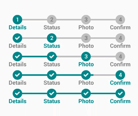
    spb_currentStateNumber => Current state number. Must be one of the following constant values : one , two , three , four .
    Related method : setCurrentStateNumber(StateNumber)

    spb_maxStateNumber  => Maximum state number. Must be one of the following constant values : one , two , three , four .
    Related method : setMaxStateNumber(StateNumber)

    spb_stateBackgroundColor  => State background color. Should be a color value. Possible forms are "#rgb", "#argb", "#rrggbb", or "#aarrggbb".
    Related method : setBackgroundColor(int)

    spb_stateForegroundColor  => State foreground color. Should be a color value. Possible forms are "#rgb", "#argb", "#rrggbb", or "#aarrggbb".
    Related method : setForegroundColor(int)

    spb_stateNumberBackgroundColor => State number background color. Should be a color value. Possible forms are "#rgb", "#argb", "#rrggbb", or "#aarrggbb".
    Related method : setStateNumberBackgroundColor(int)

    spb_stateNumberForegroundColor => State number foreground color. Should be a color value. Possible forms are "#rgb", "#argb", "#rrggbb", or "#aarrggbb".
    Related method : setStateNumberForegroundColor(int)

    spb_currentStateDescriptionColor => Current state description color. Should be a color value. Possible forms are "#rgb", "#argb", "#rrggbb", or "#aarrggbb".
    Related method : setCurrentStateDescriptionColor(int)

    spb_stateDescriptionColor => State description color. Should be a color value. Possible forms are "#rgb", "#argb", "#rrggbb", or "#aarrggbb".
    Related method : setStateDescriptionColor(int)

    spb_stateSize => State size . Must be a dimension value with preferrable unit of dp eg. 25dp
    Related method : setStateSize(float)

    spb_stateTextSize => State text(number) size . Must be a dimension value with preferrable unit of sp eg. 15sp
    Related method : setStateNumberTextSize(float)

    spb_stateDescriptionSize => State description size . Must be a dimension value with preferrable unit of dp eg. 20dp
    Related method : setStateDescriptionSize(float)        

    spb_stateLineThickness => State joining line size(thickness) . Must be a dimension value with preferrable unit of dp eg. 10dp
    Related method : setStateLineThickness(float)

    spb_checkStateCompleted => Check completed states . Must be a boolean value,either "true" or "false"
    Related method : checkStateCompleted(boolean)        

    spb_animateToCurrentProgressState => Animate joining line to current progress state . Must be a boolean value,either "true" or "false"
    Related method : enableAnimationToCurrentState(boolean)        

    spb_enableAllStatesCompleted => Check all states . Must be a boolean value,either "true" or "false"
    Related method : setAllStatesCompleted(boolean)         

    spb_descriptionTopSpaceDecrementer => Space between state and description decrementer . Must be a dimension value with preferrable unit of dp eg. 10dp
    Related method : setDescriptionTopSpaceDecrementer(float)

    spb_descriptionTopSpaceIncrementer => Space between state and description incrementer . Must be a dimension value with preferrable unit of dp eg. 10dp
    Related method : setDescriptionTopSpaceIncrementer(float)

    spb_animationDuration => State joining line animation duration . Must be an integer value eg. "500" , "1000" , "2000" , "5000" , "10000" etc
    Related method : setAnimationDuration(int)

    spb_animationStartDelay => State joining line animation start delay . Must be an integer value eg. "500" , "1000" , "2000" , "5000" , "10000" etc
    Related method : setAnimationStartDelay(int)

JAVA

StateProgressBar stateProgressBar = (StateProgressBar) findViewById(R.id.state_progress_bar);
stateProgressBar.setForegroundColor(ContextCompat.getColor(this, R.color.demo_state_foreground_color));
stateProgressBar.setBackgroundColor(ContextCompat.getColor(this, android.R.color.darker_gray));

stateProgressBar.setStateNumberForegroundColor(ContextCompat.getColor(this, android.R.color.white));
stateProgressBar.setStateNumberBackgroundColor(ContextCompat.getColor(this, android.R.color.background_dark));

stateProgressBar.setStateSize(40f);
stateProgressBar.setStateNumberTextSize(20f);
stateProgressBar.setStateLineThickness(10f);

stateProgressBar.enableAnimationToCurrentState(true);

stateProgressBar.setDescriptionTopSpaceIncrementer(10f);
stateProgressBar.setStateDescriptionSize(18f);

stateProgressBar.setCurrentStateDescriptionColor(ContextCompat.getColor(this, R.color.description_foreground_color));
stateProgressBar.setStateDescriptionColor(ContextCompat.getColor(this,  R.color.description_background_color));

EXTRA DEMOS(WITH CODES)

  • A Two-State StateProgressBar
    alt tag
<com.kofigyan.stateprogressbar.StateProgressBar
  android:layout_width="wrap_content"
  android:layout_height="wrap_content"
  app:spb_currentStateNumber="one"
  app:spb_maxStateNumber="two"/>

  • A Three-State StateProgressBar
    alt tag
  <com.kofigyan.stateprogressbar.StateProgressBar
  android:layout_width="wrap_content"
  android:layout_height="wrap_content"
  app:spb_currentStateNumber="two"
  app:spb_maxStateNumber="three"/>

  • A Four-State StateProgressBar
    alt tag
   <com.kofigyan.stateprogressbar.StateProgressBar
   android:layout_width="wrap_content"
   android:layout_height="wrap_content"
   app:spb_currentStateNumber="three"
   app:spb_maxStateNumber="four"/>

  • Check States Completed
    alt tag
   <com.kofigyan.stateprogressbar.StateProgressBar
   android:layout_width="wrap_content"
   android:layout_height="wrap_content"
   app:spb_currentStateNumber="three"
   app:spb_maxStateNumber="four"
   app:spb_checkStateCompleted="true"/>

  • Check All States
    alt tag
           <com.kofigyan.stateprogressbar.StateProgressBar
           android:layout_width="wrap_content"
           android:layout_height="wrap_content"
           app:spb_currentStateNumber="three"
           app:spb_maxStateNumber="four"
           app:spb_enableAllStatesCompleted="true"/>
    
    
  • Animate to Current State
    alt tag
       <com.kofigyan.stateprogressbar.StateProgressBar
           android:layout_width="wrap_content"
           android:layout_height="wrap_content"
           app:spb_currentStateNumber="three"
           app:spb_maxStateNumber="four"
           app:spb_stateBackgroundColor="#BDBDBD"
           app:spb_stateForegroundColor="#DB0082"
           app:spb_stateNumberBackgroundColor="#808080"
           app:spb_stateNumberForegroundColor="#eeeeee"
           app:spb_currentStateDescriptionColor="#DB0082"
           app:spb_stateDescriptionColor="#808080"
           app:spb_animateToCurrentProgressState="true"
           app:spb_checkStateCompleted="true"/>       
    
  • Add Description Data to StateProgressBar
    alt tag
 <com.kofigyan.stateprogressbar.StateProgressBar
 android:id="@+id/your_state_progress_bar_id"
 android:layout_width="wrap_content"
 android:layout_height="wrap_content"
 app:spb_currentStateNumber="two"
 app:spb_maxStateNumber="four"/>

String[] descriptionData = {"Details", "Status", "Photo", "Confirm"};

@Override
protected void onCreate(Bundle savedInstanceState) {
 super.onCreate(savedInstanceState);
 setContentView(R.layout.your_layout);

 StateProgressBar stateProgressBar = (StateProgressBar) findViewById(R.id.your_state_progress_bar_id);
 stateProgressBar.setStateDescriptionData(descriptionData);

}

  • Change Colors (State Background , State Foreground, State Number Background ,State Number Foreground, Current State Description, State Description)
    alt tag
    <com.kofigyan.stateprogressbar.StateProgressBar
      android:layout_width="wrap_content"
      android:layout_height="wrap_content"
      app:spb_currentStateNumber="three"
      app:spb_maxStateNumber="four"
      app:spb_stateBackgroundColor="#BDBDBD"
      app:spb_stateForegroundColor="#009688"
      app:spb_stateNumberBackgroundColor="#808080"
      app:spb_stateNumberForegroundColor="#eeeeee"
      app:spb_currentStateDescriptionColor="#009688"
      app:spb_stateDescriptionColor="#808080"
      app:spb_checkStateCompleted="true"/>
    
    
  • Description Top Spacing
    alt tag
    <com.kofigyan.stateprogressbar.StateProgressBar
           android:layout_width="wrap_content"
           android:layout_height="wrap_content"
           app:spb_descriptionTopSpaceIncrementer="5dp"/>
    
    
           String[] descriptionData = {"Details", "Status", "Photo", "Confirm"};
    
           @Override
           protected void onCreate(Bundle savedInstanceState) {
               super.onCreate(savedInstanceState);
               setContentView(R.layout.your_layout);
    
               StateProgressBar stateProgressBar = (StateProgressBar) findViewById(R.id.your_state_progress_bar_id);
               stateProgressBar.setStateDescriptionData(descriptionData);
    
           }
    
    
  • Change Dimensions (State, State Number ,State Line and State Description sizes)
    alt tag
    <com.kofigyan.stateprogressbar.StateProgressBar
    android:layout_width="wrap_content"
    android:layout_height="wrap_content"
    app:spb_descriptionTopSpaceIncrementer="2dp"
    app:spb_stateDescriptionSize="20sp"
    app:spb_stateLineThickness="10dp"
    app:spb_stateSize="40dp"
    app:spb_stateTextSize="15sp" />

2016年9月22日 星期四

tab in android app

Ref : http://www.androidhive.info/2015/09/android-material-design-working-with-tabs/


1. Making the App Material

We’ll start this by creating a new project and applying the material theme. If you are not aware of android material design, my previous article Android Getting Started with Material Design gives you a good start.
1. In Android Studio, go to File ⇒ New Project and fill all the details required to create a new project. When it prompts to select a default activity, select Blank Activity and proceed.
2. Open build.gradle and add android design support library com.android.support:design:23.0.1
build.gradle
dependencies {
    compile fileTree(dir: 'libs', include: ['*.jar'])
    compile 'com.android.support:appcompat-v7:23.0.1'
    compile 'com.android.support:design:23.0.1'
}
3. Open colors.xml located under res ⇒ values and add the below color values.

colors.xml
<?xml version="1.0" encoding="utf-8"?>
<resources>
    <color name="colorPrimary">#125688</color>
    <color name="colorPrimaryDark">#125688</color>
    <color name="textColorPrimary">#FFFFFF</color>
    <color name="windowBackground">#FFFFFF</color>
    <color name="navigationBarColor">#000000</color>
    <color name="colorAccent">#c8e8ff</color>
</resources>
4. Add the below dimensions to dimens.xml located under res ⇒ values.
dimens.xml
<resources>
    <!-- Default screen margins, per the Android Design guidelines. -->
    <dimen name="activity_horizontal_margin">16dp</dimen>
    <dimen name="activity_vertical_margin">16dp</dimen>
    <dimen name="tab_max_width">264dp</dimen>
    <dimen name="tab_padding_bottom">16dp</dimen>
    <dimen name="tab_label">14sp</dimen>
    <dimen name="custom_tab_layout_height">72dp</dimen>
</resources>
5. Open styles.xml located under res ⇒ values and add below styles. The styles defined in this styles.xml are common to all the android versions.

styles.xml
<resources>
 
    <style name="MyMaterialTheme" parent="MyMaterialTheme.Base">
 
    </style>
 
    <style name="MyMaterialTheme.Base" parent="Theme.AppCompat.Light.DarkActionBar">
        <item name="windowNoTitle">true</item>
        <item name="windowActionBar">false</item>
        <item name="colorPrimary">@color/colorPrimary</item>
        <item name="colorPrimaryDark">@color/colorPrimaryDark</item>
        <item name="colorAccent">@color/colorAccent</item>
    </style>
 
</resources>

6. Now under res, create a folder named values-v21. Inside values-v21, create another styles.xml with the below styles. These styles are specific to Android 5.0
styles.xml
<resources>
 
    <style name="MyMaterialTheme" parent="MyMaterialTheme.Base">
        <item name="android:windowContentTransitions">true</item>
        <item name="android:windowAllowEnterTransitionOverlap">true</item>
        <item name="android:windowAllowReturnTransitionOverlap">true</item>
        <item name="android:windowSharedElementEnterTransition">@android:transition/move</item>
        <item name="android:windowSharedElementExitTransition">@android:transition/move</item>
    </style>
 
</resources>
7. Finally open AndroidManifest.xml and modify the theme to our customized theme by changing theandroid:theme attribute value.
android:theme="@style/MyMaterialTheme"
AndroidManifest.xml
<?xml version="1.0" encoding="utf-8"?>
    package="info.androidhive.materialtabs" >
 
    <application
        android:allowBackup="true"
        android:icon="@mipmap/ic_launcher"
        android:label="@string/app_name"
        android:theme="@style/MyMaterialTheme" >
        <activity
            android:name=".activity.MainActivity"
            android:label="@string/app_name" >
            <intent-filter>
                <action android:name="android.intent.action.MAIN" />
 
                <category android:name="android.intent.category.LAUNCHER" />
            </intent-filter>
        </activity>
    </application>
</manifest>
Run the app and verify the material theme by observing the notification bar color. If you see the notification bar color changed, it means that the material design theme is applied successfully.

Now we have our app material ready. So let’s start adding the tabs. But before that we’ll create few fragment activities for testing purpose. All these fragment activities contains very simple UI with only one TextView.
8. Under your main package create a fragment named OneFragment.java and add the below code.

OneFragment.java
package info.androidhive.materialtabs.fragments;
 
import android.os.Bundle;
import android.support.v4.app.Fragment;
import android.view.LayoutInflater;
import android.view.View;
import android.view.ViewGroup;
 
import info.androidhive.materialtabs.R;
 
 
public class OneFragment extends Fragment{
 
    public OneFragment() {
        // Required empty public constructor
    }
 
    @Override
    public void onCreate(Bundle savedInstanceState) {
        super.onCreate(savedInstanceState);
    }
 
    @Override
    public View onCreateView(LayoutInflater inflater, ViewGroup container,
                             Bundle savedInstanceState) {
        // Inflate the layout for this fragment
        return inflater.inflate(R.layout.fragment_one, container, false);
    }
 
}

9. Open fragment_one.xml located under res ⇒ layout and do the below changes.
fragment_one.xml
<RelativeLayout xmlns:android="http://schemas.android.com/apk/res/android"
    xmlns:tools="http://schemas.android.com/tools"
    android:layout_width="match_parent"
    android:layout_height="match_parent"
    tools:context="info.androidhive.materialtabs.fragments.OneFragment">
 
    <TextView
        android:layout_width="wrap_content"
        android:layout_height="wrap_content"
        android:text="@string/one"
        android:textSize="40dp"
        android:textStyle="bold"
        android:layout_centerInParent="true"/>
 
</RelativeLayout>
10. Likewise create few more fragment activities with same code we used for OneFragment.java. I have createdTwoFragment.javaThreeFragment.javaFourFragemnt.java ….. upto TenFragment.java

2. Fixed Tabs

Fixed tabs should be used when you have limited number of tabs. These tabs are fixed in position. In android design support library lot of new elements like CoordinatorLayout, AppBarLayout, TabLayout and lot more were introduced. I won’t cover all of these as it’s not the agenda of this article.
11. Open the layout file of main activity (activity_main.xml) and add below layout code.
app:tabMode – Defines the mode of the tab layout. In our case the value should be “fixed

activity_main.xml
<android.support.design.widget.CoordinatorLayout xmlns:android="http://schemas.android.com/apk/res/android"
    android:layout_width="match_parent"
    android:layout_height="match_parent">
 
    <android.support.design.widget.AppBarLayout
        android:layout_width="match_parent"
        android:layout_height="wrap_content"
        android:theme="@style/ThemeOverlay.AppCompat.Dark.ActionBar">
 
        <android.support.v7.widget.Toolbar
            android:id="@+id/toolbar"
            android:layout_width="match_parent"
            android:layout_height="?attr/actionBarSize"
            android:background="?attr/colorPrimary"
            app:layout_scrollFlags="scroll|enterAlways"
            app:popupTheme="@style/ThemeOverlay.AppCompat.Light" />
 
        <android.support.design.widget.TabLayout
            android:id="@+id/tabs"
            android:layout_width="match_parent"
            android:layout_height="wrap_content"
            app:tabMode="fixed"
            app:tabGravity="fill"/>
    </android.support.design.widget.AppBarLayout>
 
    <android.support.v4.view.ViewPager
        android:id="@+id/viewpager"
        android:layout_width="match_parent"
        android:layout_height="match_parent"
        app:layout_behavior="@string/appbar_scrolling_view_behavior"  />
</android.support.design.widget.CoordinatorLayout>
12. Open MainActivity.java and do the below changes.
tabLayout.setupWithViewPager() – Assigns the ViewPager to TabLayout.
setupViewPager() – Defines the number of tabs by setting appropriate fragment and tab name.
ViewPagerAdapter – Custom adapter class provides fragments required for the view pager.

MainActivity.java
package info.androidhive.materialtabs.activity;
 
import android.os.Bundle;
import android.support.design.widget.TabLayout;
import android.support.v4.app.Fragment;
import android.support.v4.app.FragmentManager;
import android.support.v4.app.FragmentPagerAdapter;
import android.support.v4.view.ViewPager;
import android.support.v7.app.AppCompatActivity;
import android.support.v7.widget.Toolbar;
 
import java.util.ArrayList;
import java.util.List;
 
import info.androidhive.materialtabs.R;
import info.androidhive.materialtabs.fragments.OneFragment;
import info.androidhive.materialtabs.fragments.ThreeFragment;
import info.androidhive.materialtabs.fragments.TwoFragment;
 
public class MainActivity extends AppCompatActivity {
 
    private Toolbar toolbar;
    private TabLayout tabLayout;
    private ViewPager viewPager;
 
    @Override
    protected void onCreate(Bundle savedInstanceState) {
        super.onCreate(savedInstanceState);
        setContentView(R.layout.activity_main);
 
        toolbar = (Toolbar) findViewById(R.id.toolbar);
        setSupportActionBar(toolbar);
 
        getSupportActionBar().setDisplayHomeAsUpEnabled(true);
 
        viewPager = (ViewPager) findViewById(R.id.viewpager);
        setupViewPager(viewPager);
 
        tabLayout = (TabLayout) findViewById(R.id.tabs);
        tabLayout.setupWithViewPager(viewPager);
    }
 
    private void setupViewPager(ViewPager viewPager) {
        ViewPagerAdapter adapter = new ViewPagerAdapter(getSupportFragmentManager());
        adapter.addFragment(new OneFragment(), "ONE");
        adapter.addFragment(new TwoFragment(), "TWO");
        adapter.addFragment(new ThreeFragment(), "THREE");
        viewPager.setAdapter(adapter);
    }
 
    class ViewPagerAdapter extends FragmentPagerAdapter {
        private final List<Fragment> mFragmentList = new ArrayList<>();
        private final List<String> mFragmentTitleList = new ArrayList<>();
 
        public ViewPagerAdapter(FragmentManager manager) {
            super(manager);
        }
 
        @Override
        public Fragment getItem(int position) {
            return mFragmentList.get(position);
        }
 
        @Override
        public int getCount() {
            return mFragmentList.size();
        }
 
        public void addFragment(Fragment fragment, String title) {
            mFragmentList.add(fragment);
            mFragmentTitleList.add(title);
        }
 
        @Override
        public CharSequence getPageTitle(int position) {
            return mFragmentTitleList.get(position);
        }
    }
}
Now run the app. You should able to see the tabs displayed with swipe functionality between the tabs


2.1 Full Width Tabs

If you want the tabs to be occupied the fullwidth of the screen, you need to assign app:tabGravity=”fill” to our TabLayout.


2.2 Center Aligned Tabs

If you want to keep your tabs horizontally centered, assign app:tabGravity=”center” to TabLayout.